Client
Miyagi Japanese Restaurant
Industry
Hospitality & F&B · Japanese Restaurant
Right down to the chopstick sleeve.
Miyagi already had a name and a mark, a kitchen people came back for, and a room that welcomed them. We designed the printed details to match: the menu, the storefront, and the small things a diner holds without thinking, down to the chopstick sleeve.
Client
Miyagi Japanese Restaurant
Industry
Hospitality & F&B · Japanese Restaurant
Right down to the chopstick sleeve.
Miyagi already had a name and a mark, a kitchen people came back for, and a room that welcomed them. We designed the printed details to match: the menu, the storefront, and the small things a diner holds without thinking, down to the chopstick sleeve.

THE STORY
Miyagi came to us with the two things it wanted to keep, the name and the logo, and a clear idea of who it was. The food was good and the room was warm. What it wanted was for the printed pieces a guest handles, the menu, the napkin, the chopstick sleeve, to carry the same care as everything else. These are the details most easily overlooked. A kitchen and a dining room get the attention; the small things that sit on the table all night are often left generic. Miyagi wanted them to feel of a piece with the room and the food, made for the place rather than ordered from a catalogue.
THE Approach
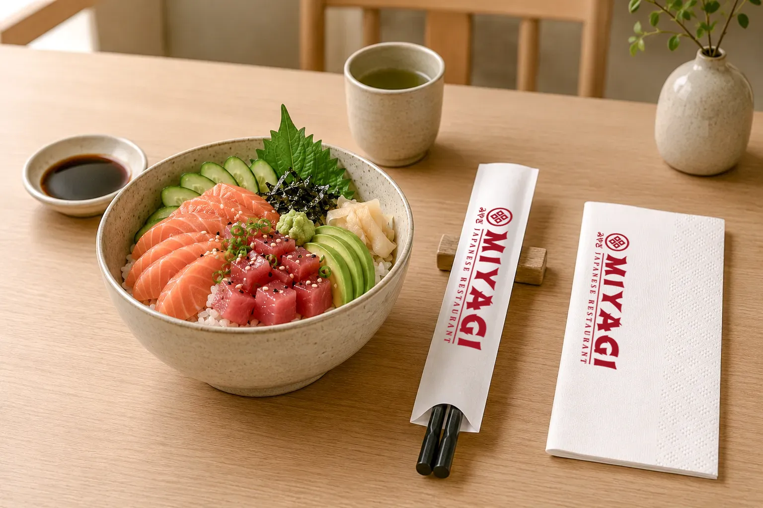
We kept the logo and built outward from it. The existing mark, the framed crest and the みやぎ kana, set the tone, traditional, quiet, a little formal, and we extended that feeling into every piece a guest touches. Then we worked down the scale, from the largest touchpoint to the smallest. The storefront drape and poster to draw a guest in from the street. The menu, bound with brass rivets in an embossed cover, made to be held and reopened rather than wiped down. The napkin and the chopstick sleeve, designed and supplied, carrying the mark in Miyagi red, so the brand reaches the guest even in the smallest gesture, the moment they unwrap their chopsticks. Nothing here is loud. The point of detail work is that a guest should not notice it, only feel that the place is whole. That feeling is built from the things most restaurants leave plain.


WHAT WE MADE
The printed details of the dining experience, designed to feel of a piece with the room and the kitchen. The storefront drew guests in: the entrance drape and poster, the brand's face on the street. The menu was made to be held: an embossed cover bound with brass rivets, designed and printed. The table pieces carried the mark to the smallest gesture: the napkin and chopstick sleeve, designed and supplied, in Miyagi red.
Client
Miyagi Japanese Restaurant
Industry
Hospitality & F&B · Japanese Restaurant
Right down to the chopstick sleeve.
Miyagi already had a name and a mark, a kitchen people came back for, and a room that welcomed them. We designed the printed details to match: the menu, the storefront, and the small things a diner holds without thinking, down to the chopstick sleeve.
THE STORY
Miyagi came to us with the two things it wanted to keep, the name and the logo, and a clear idea of who it was. The food was good and the room was warm. What it wanted was for the printed pieces a guest handles, the menu, the napkin, the chopstick sleeve, to carry the same care as everything else. These are the details most easily overlooked. A kitchen and a dining room get the attention; the small things that sit on the table all night are often left generic. Miyagi wanted them to feel of a piece with the room and the food, made for the place rather than ordered from a catalogue.
THE Approach
We kept the logo and built outward from it. The existing mark, the framed crest and the みやぎ kana, set the tone, traditional, quiet, a little formal, and we extended that feeling into every piece a guest touches. Then we worked down the scale, from the largest touchpoint to the smallest. The storefront drape and poster to draw a guest in from the street. The menu, bound with brass rivets in an embossed cover, made to be held and reopened rather than wiped down. The napkin and the chopstick sleeve, designed and supplied, carrying the mark in Miyagi red, so the brand reaches the guest even in the smallest gesture, the moment they unwrap their chopsticks. Nothing here is loud. The point of detail work is that a guest should not notice it, only feel that the place is whole. That feeling is built from the things most restaurants leave plain.
WHAT WE MADE
The printed details of the dining experience, designed to feel of a piece with the room and the kitchen. The storefront drew guests in: the entrance drape and poster, the brand's face on the street. The menu was made to be held: an embossed cover bound with brass rivets, designed and printed. The table pieces carried the mark to the smallest gesture: the napkin and chopstick sleeve, designed and supplied, in Miyagi red.