Client
SIN SZE SI YA TEMPLE 仙四師爺廟
Industry
Cultural & Religious Heritage · Taoist Temple
As old as the city it watches over, painted anew.
A poster campaign for the Sin Sze Si Sze Ya Temple, founded in 1864 by Kapitan Yap Ah Loy and the first Chinese temple in Kuala Lumpur. To mark its three day festival and the birthday of the Sze Si Ya, we wrote every word, painted every illustration, and built a five poster system carried across print, social, and out of home.
Client
SIN SZE SI YA TEMPLE 仙四師爺廟
Industry
Cultural & Religious Heritage · Taoist Temple
As old as the city it watches over, painted anew.
A poster campaign for the Sin Sze Si Sze Ya Temple, founded in 1864 by Kapitan Yap Ah Loy and the first Chinese temple in Kuala Lumpur. To mark its three day festival and the birthday of the Sze Si Ya, we wrote every word, painted every illustration, and built a five poster system carried across print, social, and out of home.
THE STORY
The Sin Sze Si Sze Ya Temple has stood on Jalan Tun H.S. Lee since the nineteenth century, the oldest Taoist temple in Kuala Lumpur and one of the city's founding institutions. Each year it holds a three day festival around the birthday of the Sze Si Ya, layered with rites of blessing, protection, and remembrance. The challenge of a festival like this is communication, not faith. Its rituals carry centuries of meaning, and that meaning deserves to travel: to longtime devotees who know the rites by heart, and to a wider audience meeting them for the first time. A poster has to hold both, the depth the tradition demands and the openness a new visitor needs. The temple does not need to be modernised. It needs to be made legible, in two languages, without flattening what makes it sacred.
THE Approach
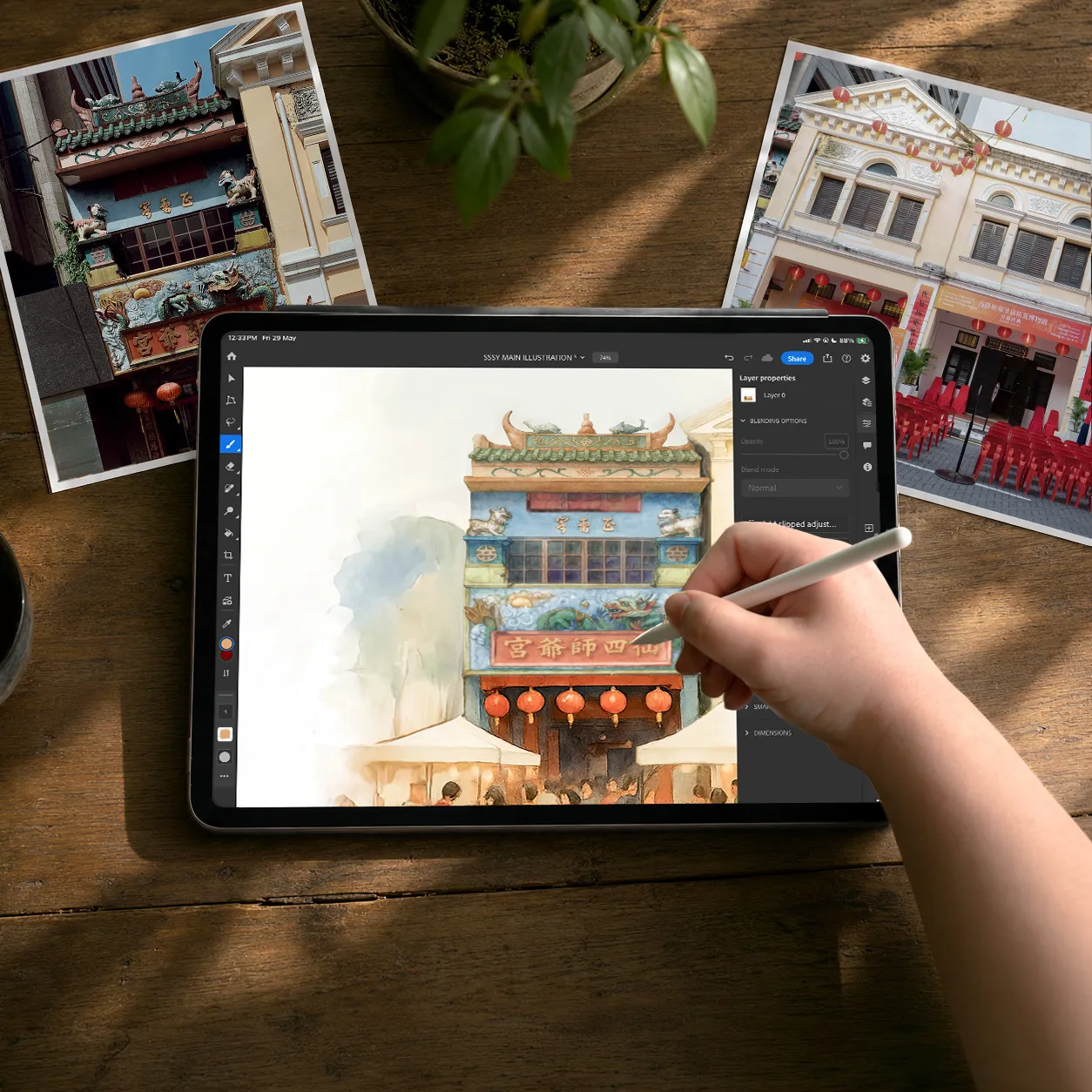
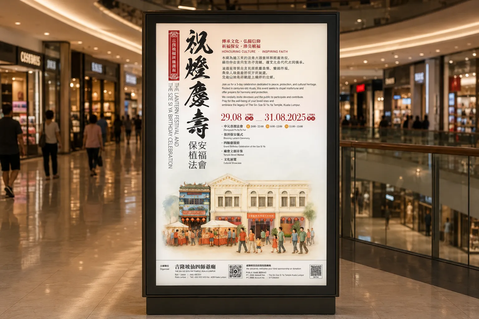
We made two decisions early. The illustrations would be painted, not photographed. The writing would be set in parallel, Chinese and English carrying the same reverence rather than one translated from the other. The watercolour was drawn digitally, in house, in the festive palette the occasion calls for: sunrise reds, warm yellows, ivory, set throughout in traditional Chinese characters as the temple requested. For the festival, we painted the temple facade and the street market unfolding before it. For the offerings, we painted the sacred objects themselves, the Li Dou vessel and its twelve treasures, the transcendence tablets, the lotus Peace Lamps, the ivory amulets. Then we wrote it. The Chinese follows the cadence of temple liturgy, in four character couplets. The English carries the same weight in a voice a new reader can feel. 傳承文化 · 弘揚信仰 became Honouring Culture · Inspiring Faith, not a literal rendering, but a true one.
WHAT WE MADE
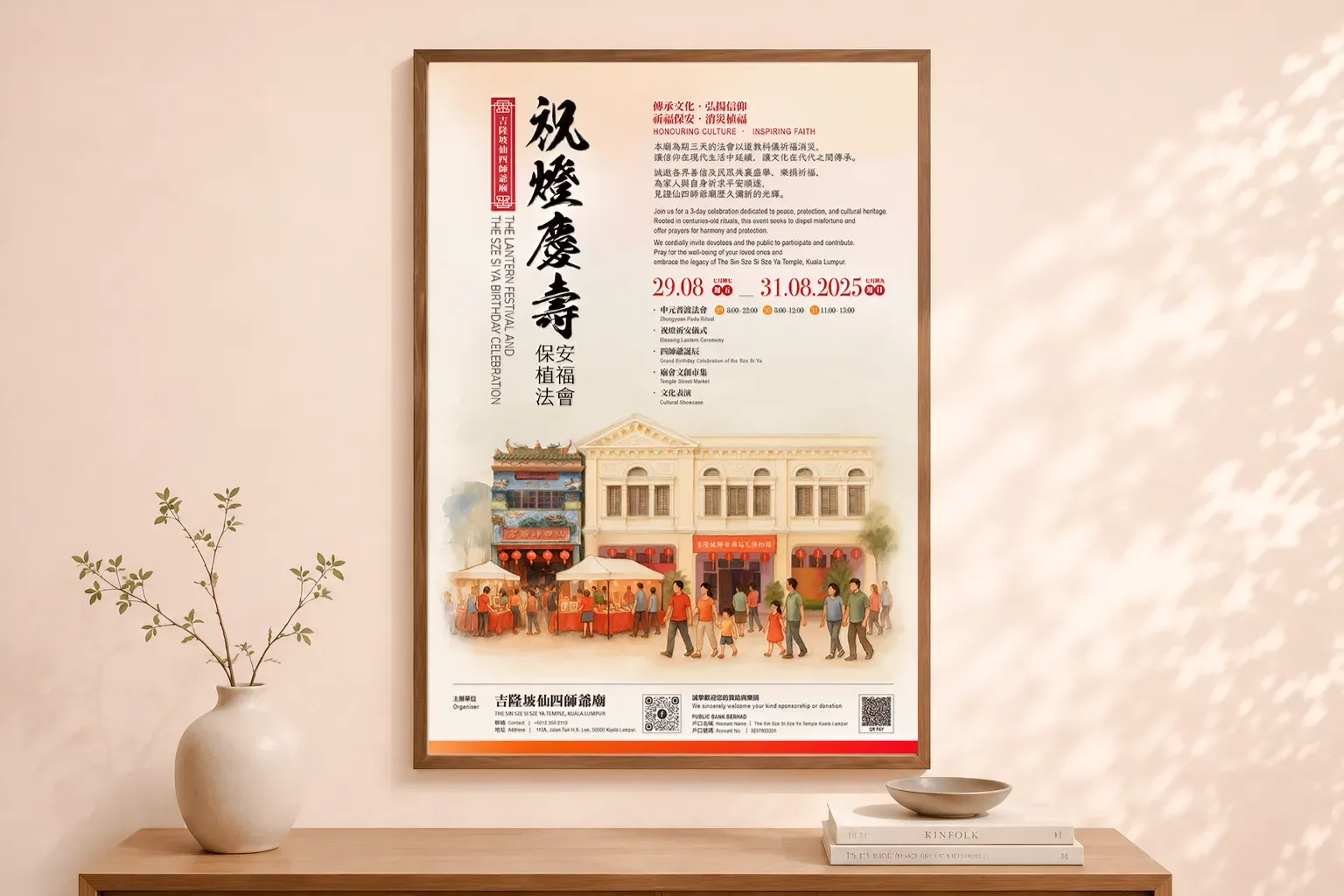
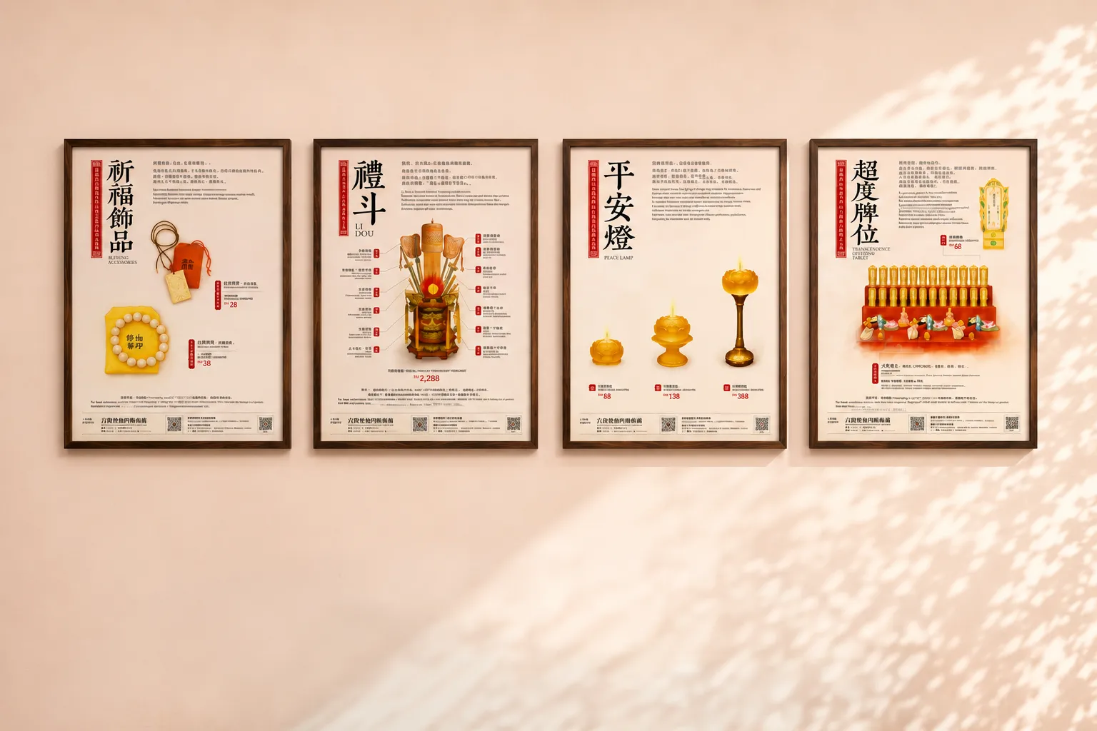
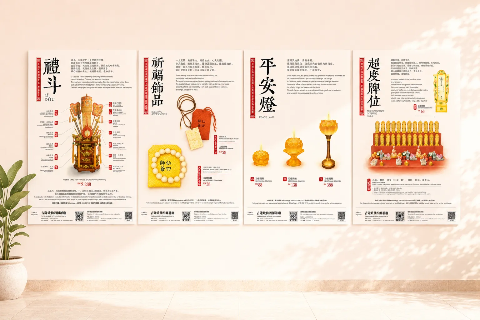
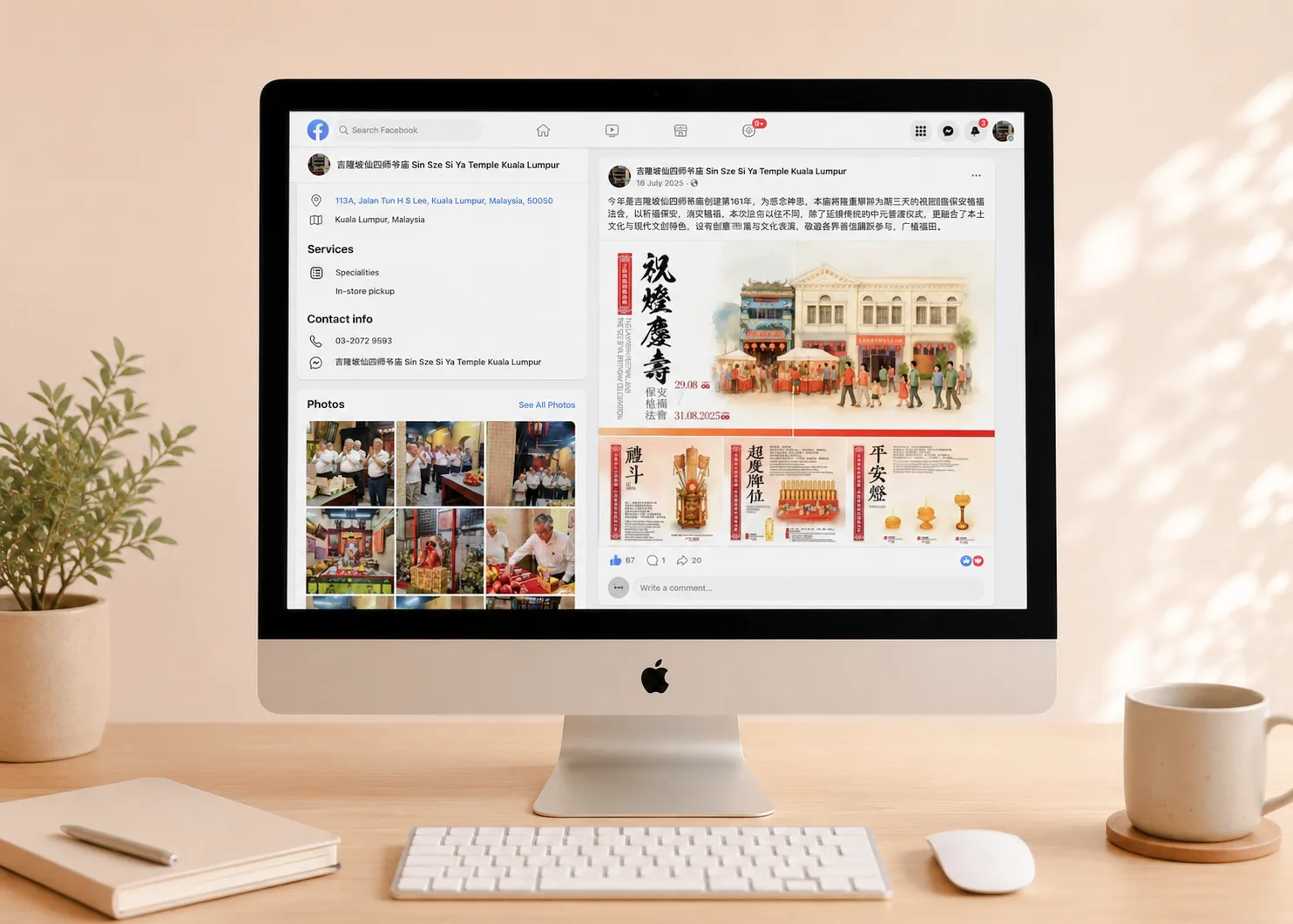
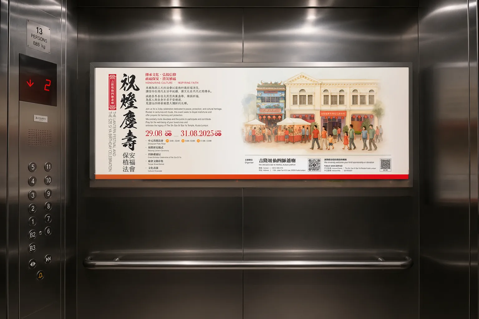
One system across five posters, written, painted, and designed in house, then carried into social. The main event poster held the festival's identity: the brushed title, the three day programme, and the painted temple scene. The four devotional posters each presented one sacred offering, with its own watercolour and bilingual text: the Li Dou and its twelve treasures, the Transcendence Offering Tablet, the Peace Lamp, the Blessing Accessories. The social rollout adapted the system for Facebook posts and covers, holding the palette, the illustration, and the bilingual voice consistent across every placement.
Client
SIN SZE SI YA TEMPLE 仙四師爺廟
Industry
Cultural & Religious Heritage · Taoist Temple
As old as the city it watches over, painted anew.
A poster campaign for the Sin Sze Si Sze Ya Temple, founded in 1864 by Kapitan Yap Ah Loy and the first Chinese temple in Kuala Lumpur. To mark its three day festival and the birthday of the Sze Si Ya, we wrote every word, painted every illustration, and built a five poster system carried across print, social, and out of home.
THE STORY
The Sin Sze Si Sze Ya Temple has stood on Jalan Tun H.S. Lee since the nineteenth century, the oldest Taoist temple in Kuala Lumpur and one of the city's founding institutions. Each year it holds a three day festival around the birthday of the Sze Si Ya, layered with rites of blessing, protection, and remembrance. The challenge of a festival like this is communication, not faith. Its rituals carry centuries of meaning, and that meaning deserves to travel: to longtime devotees who know the rites by heart, and to a wider audience meeting them for the first time. A poster has to hold both, the depth the tradition demands and the openness a new visitor needs. The temple does not need to be modernised. It needs to be made legible, in two languages, without flattening what makes it sacred.
THE Approach
We made two decisions early. The illustrations would be painted, not photographed. The writing would be set in parallel, Chinese and English carrying the same reverence rather than one translated from the other. The watercolour was drawn digitally, in house, in the festive palette the occasion calls for: sunrise reds, warm yellows, ivory, set throughout in traditional Chinese characters as the temple requested. For the festival, we painted the temple facade and the street market unfolding before it. For the offerings, we painted the sacred objects themselves, the Li Dou vessel and its twelve treasures, the transcendence tablets, the lotus Peace Lamps, the ivory amulets. Then we wrote it. The Chinese follows the cadence of temple liturgy, in four character couplets. The English carries the same weight in a voice a new reader can feel. 傳承文化 · 弘揚信仰 became Honouring Culture · Inspiring Faith, not a literal rendering, but a true one.
WHAT WE MADE
One system across five posters, written, painted, and designed in house, then carried into social. The main event poster held the festival's identity: the brushed title, the three day programme, and the painted temple scene. The four devotional posters each presented one sacred offering, with its own watercolour and bilingual text: the Li Dou and its twelve treasures, the Transcendence Offering Tablet, the Peace Lamp, the Blessing Accessories. The social rollout adapted the system for Facebook posts and covers, holding the palette, the illustration, and the bilingual voice consistent across every placement.