Client
Sol Flora 紫阳花艺
Industry
Retail & E-commerce · Florist & Floral Gifting
Nothing blooms without light.
Sol Flora launched as a new brand, named by its owner for the sun that every flower needs. We gave it the things a new florist cannot open without: an identity to be recognised by, a complete online store, and the printed pieces that travel with every bouquet, written, designed, and produced to sell from day one.
Client
Sol Flora 紫阳花艺
Industry
Retail & E-commerce · Florist & Floral Gifting
Nothing blooms without light.
Sol Flora launched as a new brand, named by its owner for the sun that every flower needs. We gave it the things a new florist cannot open without: an identity to be recognised by, a complete online store, and the printed pieces that travel with every bouquet, written, designed, and produced to sell from day one.
THE STORY
Sol Flora began with a name and a belief. The owner had both: the Chinese name, 紫阳花艺, and a simple conviction that flowers are one of the easiest ways to say love, thanks, or to make someone smile. The name itself held a flower, 紫阳花, the hydrangea, the owner's favourite. What the brand did not yet have was a face to be recognised by, or the words to introduce itself to a stranger online. The English name carries the idea of the sun, and the owner held to it plainly: nothing blooms without light. A florist is a crowded market in Kuala Lumpur, full of the generic and the disposable. The task was to give a brand new shop a mark that felt warm and personal from the first glance, and a voice that sounded like a real person rather than a cold retail catalogue.
THE Approach
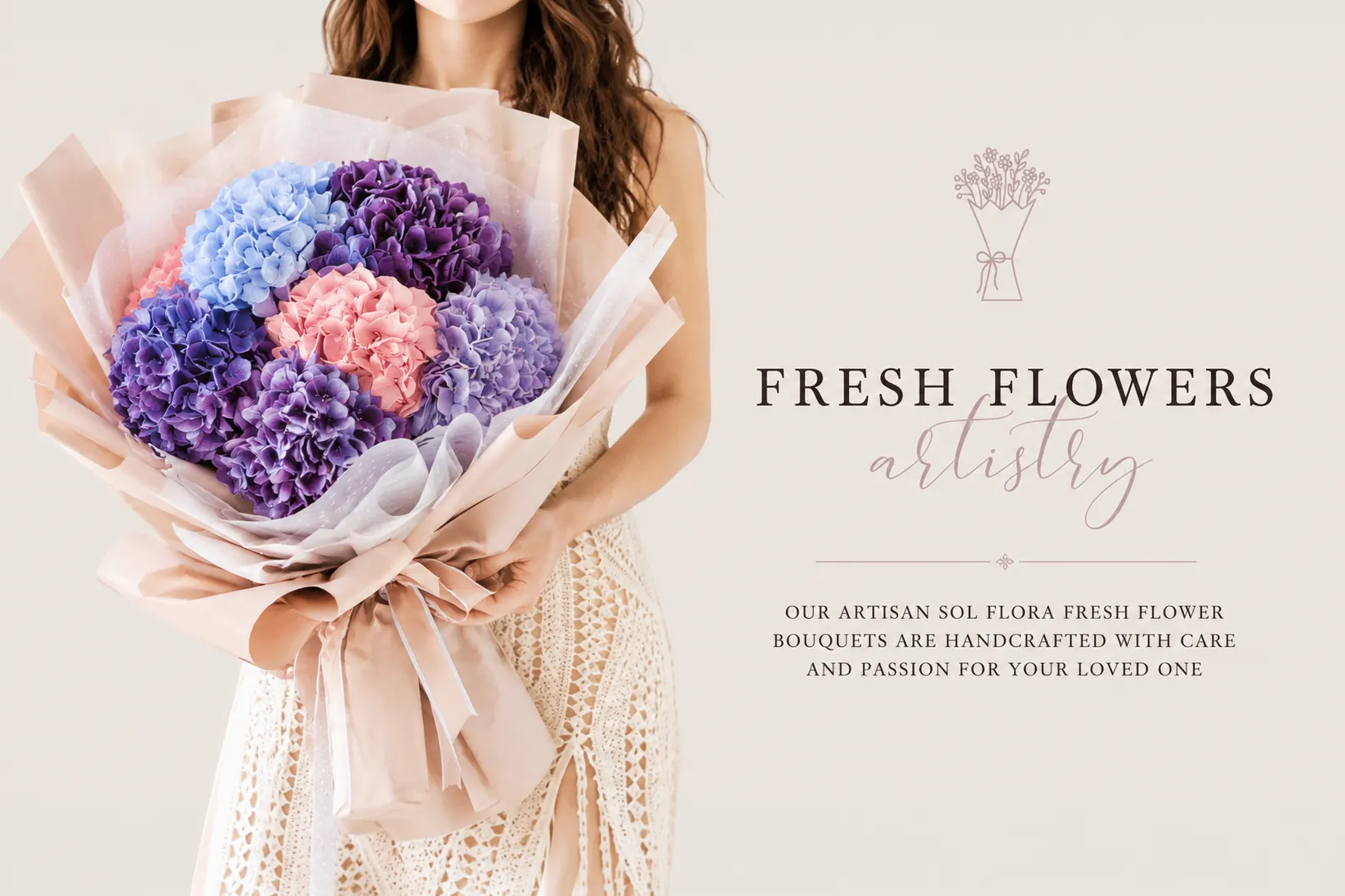
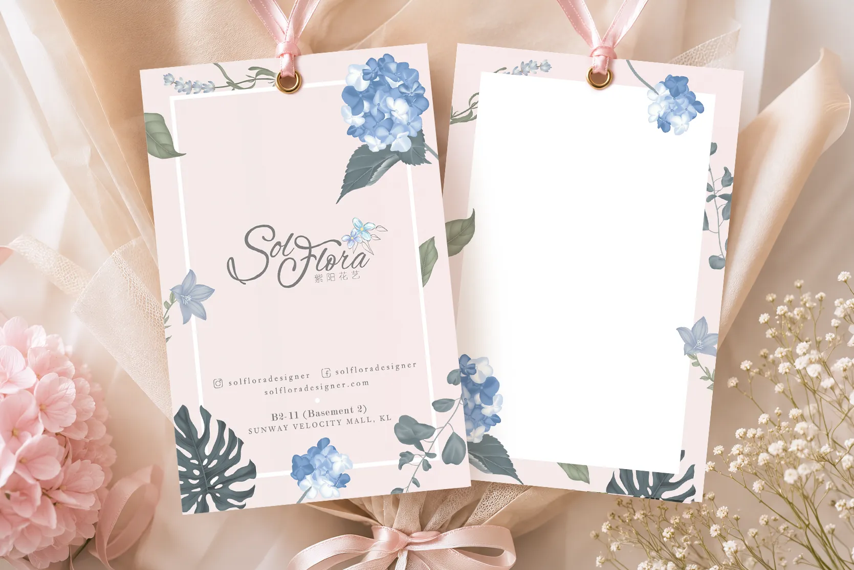
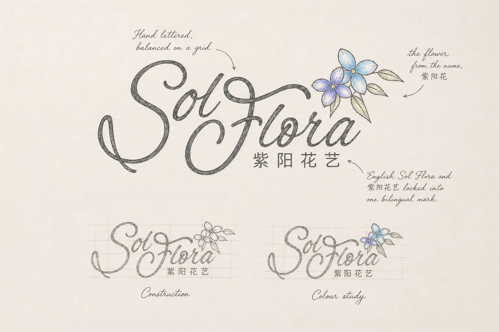
We worked from the owner's name, not over it, and the name gave us more than a sound. The English Sol reaches for the sun; the Chinese 紫阳花艺 names the hydrangea, the owner's favourite bloom. One name held the light, the other held the flower, and the identity grew from holding both. So the hydrangea became the brand's signature, and we drew it into the heart of the mark itself. The logo holds the flower, full and many petalled, and we carried it onward across the gifting collateral, the tags and printed pieces tied to every order, until a Sol Flora bouquet could be recognised before the name was even read. The mark feels sunlit and personal rather than clinical, scaled to read on a storefront, a smartphone screen, and a delicate tag alike. Then we wrote it. At launch, a new shop has no legacy to lean on, so the words must carry the trust. We wrote the website in the brand's own voice, warm, plain, unfussy, the version of the owner's belief a customer can feel. The Sol Flora story online, the sun, the hydrangea, the simple wish to make someone smile, is that voice set down in full.
WHAT WE MADE
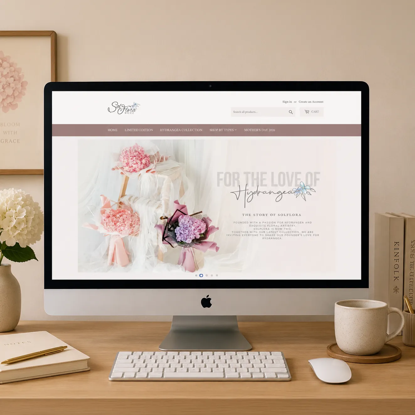
The face of a new brand, the store that sells it, and the pieces that travel with it. The logo gave Sol Flora its mark, the hydrangea drawn into its heart, built to carry across screen, storefront, and the small printed pieces a customer holds. The online store gave it a place to trade. We produced the full storefront, hero imagery and collection pages across more than a dozen ranges, and wrote every word, the brand story, the collection copy, the product voice, launch ready from the first day. The gifting collateral gave the brand something to hold. We designed the tags and printed pieces around the hydrangea signature, the small things a customer reads at the moment the flowers arrive.
Client
Sol Flora 紫阳花艺
Industry
Retail & E-commerce · Florist & Floral Gifting
Nothing blooms without light.
Sol Flora launched as a new brand, named by its owner for the sun that every flower needs. We gave it the things a new florist cannot open without: an identity to be recognised by, a complete online store, and the printed pieces that travel with every bouquet, written, designed, and produced to sell from day one.
THE STORY
Sol Flora began with a name and a belief. The owner had both: the Chinese name, 紫阳花艺, and a simple conviction that flowers are one of the easiest ways to say love, thanks, or to make someone smile. The name itself held a flower, 紫阳花, the hydrangea, the owner's favourite. What the brand did not yet have was a face to be recognised by, or the words to introduce itself to a stranger online. The English name carries the idea of the sun, and the owner held to it plainly: nothing blooms without light. A florist is a crowded market in Kuala Lumpur, full of the generic and the disposable. The task was to give a brand new shop a mark that felt warm and personal from the first glance, and a voice that sounded like a real person rather than a cold retail catalogue.
THE Approach
We worked from the owner's name, not over it, and the name gave us more than a sound. The English Sol reaches for the sun; the Chinese 紫阳花艺 names the hydrangea, the owner's favourite bloom. One name held the light, the other held the flower, and the identity grew from holding both. So the hydrangea became the brand's signature, and we drew it into the heart of the mark itself. The logo holds the flower, full and many petalled, and we carried it onward across the gifting collateral, the tags and printed pieces tied to every order, until a Sol Flora bouquet could be recognised before the name was even read. The mark feels sunlit and personal rather than clinical, scaled to read on a storefront, a smartphone screen, and a delicate tag alike. Then we wrote it. At launch, a new shop has no legacy to lean on, so the words must carry the trust. We wrote the website in the brand's own voice, warm, plain, unfussy, the version of the owner's belief a customer can feel. The Sol Flora story online, the sun, the hydrangea, the simple wish to make someone smile, is that voice set down in full.
WHAT WE MADE
The face of a new brand, the store that sells it, and the pieces that travel with it. The logo gave Sol Flora its mark, the hydrangea drawn into its heart, built to carry across screen, storefront, and the small printed pieces a customer holds. The online store gave it a place to trade. We produced the full storefront, hero imagery and collection pages across more than a dozen ranges, and wrote every word, the brand story, the collection copy, the product voice, launch ready from the first day. The gifting collateral gave the brand something to hold. We designed the tags and printed pieces around the hydrangea signature, the small things a customer reads at the moment the flowers arrive.